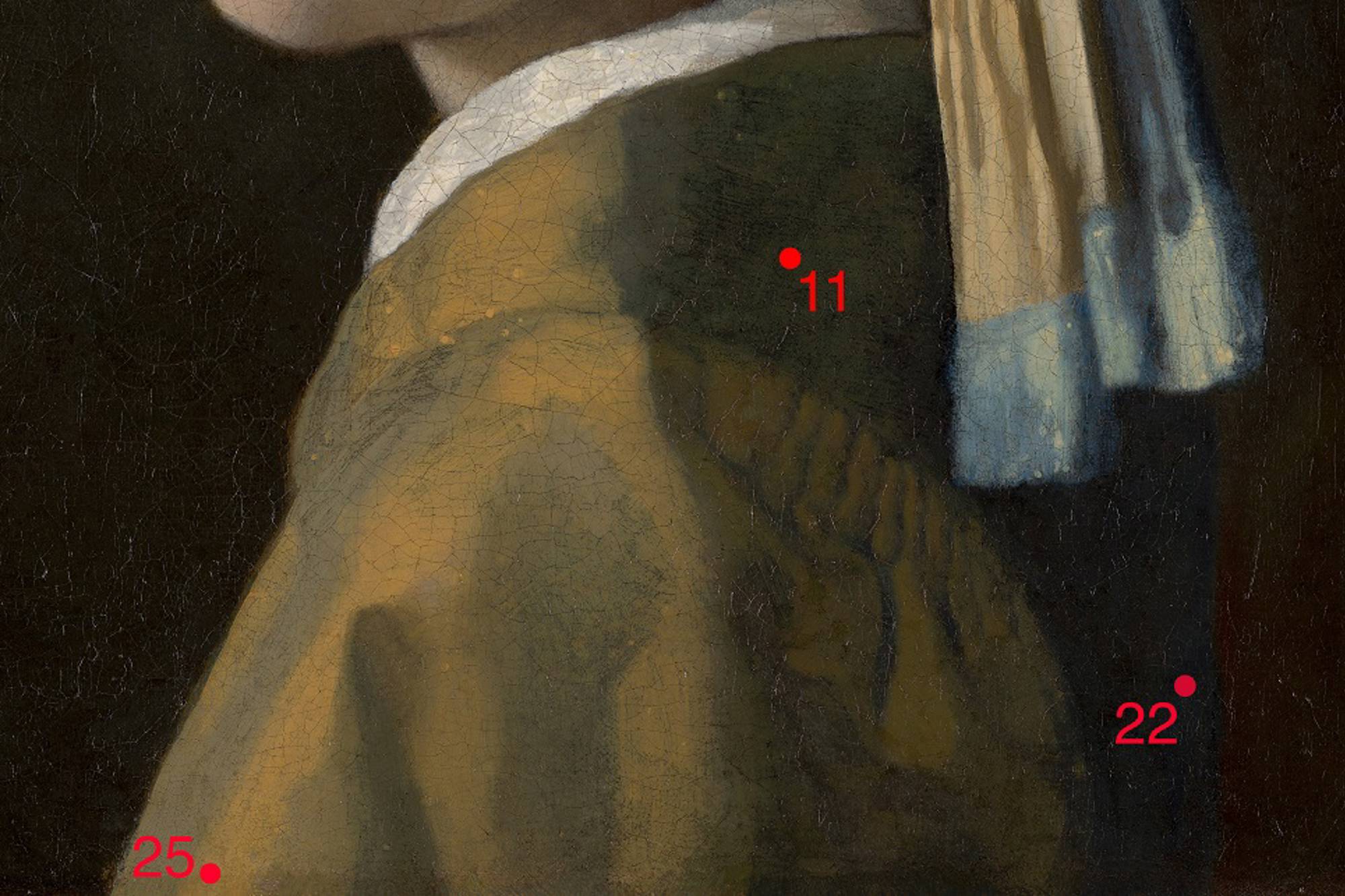
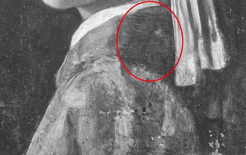
If the Girl stepped onto a red carpet, reporters might ask ‘who are you wearing?’ She is wearing an original Vermeer creation. On top of a white shirt, she has paired a contemporary jacket with a vintage blue and yellow headscarf. The inset sleeve of the jacket has cartridge pleating on the back where it meets the bodice. These are the parallel lines on the back of her shoulder.
Down-to-earth
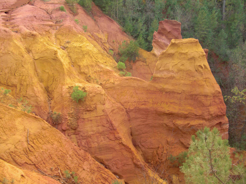
Vermeer used several yellow, red and brown pigments to paint the jacket, and they are collectively known as ‘earth pigments’. Where do they come from? They occur naturally in the earth and are mostly made up of iron oxide. The MA-XRF map for iron (Fe) shows us their distribution within the jacket, with a higher intensity in the pleating and fold behind her shoulder.

Download Image
Non-commercial use
All our images can be downloaded in high resolution from our website for non-commercial use (research/study, educational purposes, personal blogs and social media).
Would you like to use our images in a publication? Please mention our credit line: "Mauritshuis, The Hague."
Commercial use
Would you like to use our images for commercial purposes? We would be happy to discuss this with you. Please contact our marketing department at [email protected].
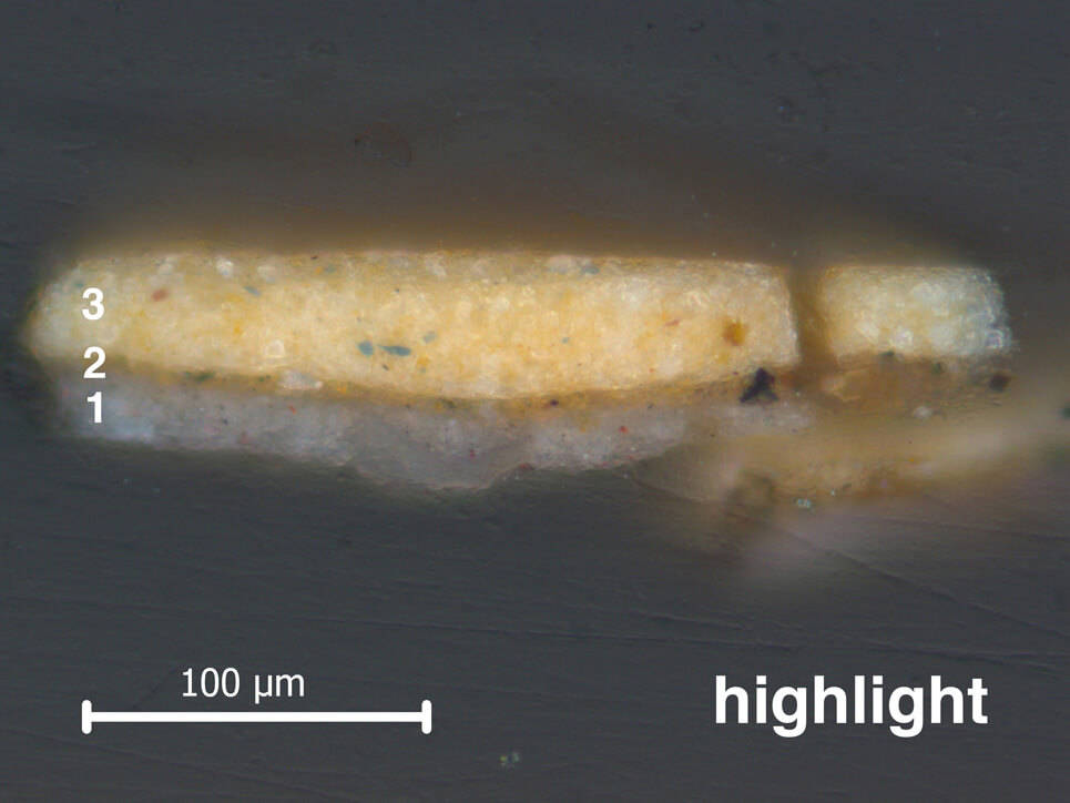
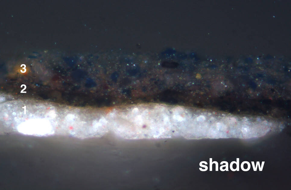
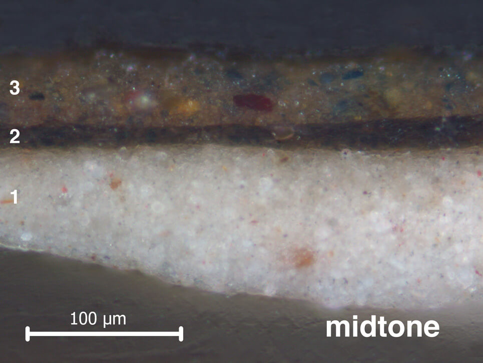
Vermeer started painting the jacket by laying in where the light and dark tones were to go. He painted this ‘dead colouring’ in different shades of brown. In the cross-sections from the Girl’s jacket, the underlayer used for dead colouring (layer 2) varies in tone and thickness depending on whether it is in the light or the shadow. Beneath the highlight, this layer is thin and light brown. Below the midtone and shadow, it is thick and dark brown.
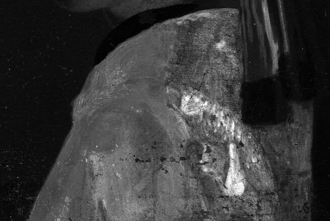
When the brown ‘dead colouring’ was dry, Vermeer applied only one layer of paint on top (layer 3). In some areas on her jacket – like the cartridge pleats on the back of her shoulder – he left the underlayer to shimmer through. The underlayer on her back contains carbon black, which can be detected using infrared. In the infrared photograph of her shoulder, you can see that Vermeer applied it with a wide brush.
